
Short answer: Lovable gives you default design when you give it no design decisions. Make the decisions first. Pick a direction, lock it into exact values, then cut what your user does not need. Below: three stages, four styles with prompts you can copy, and a checklist to ship against.
I built futurehabits.tech in Lovable, and I coach founders who build their first apps there. This is the design brief I give it.
Key takeaways
- Without direction, models pick the most common design patterns in their training data.
- Work in three stages: discover several directions, define one in exact values, deliver by critiquing and cutting.
- Review the rendered screen, not the code. Fix the biggest problem first, then check again.
- Design focus, empty, loading and error states.
- Choose the style for your user. Gradients and glass are the default slop, so use them with a reason.
Same idea, three builds
This guide supports an EU-funded training programme for tourism SMEs on responsible AI. Through FutureHabits.Tech I am a partner in the programme, and I worked on its toolkit and guidebooks. The guide also draws on my work with founders at Founder Institute and with travel tech startups. Below, one visitor guide for a rural region is shown three ways, all made in Lovable. Same place, same content. Three design decisions, three results.
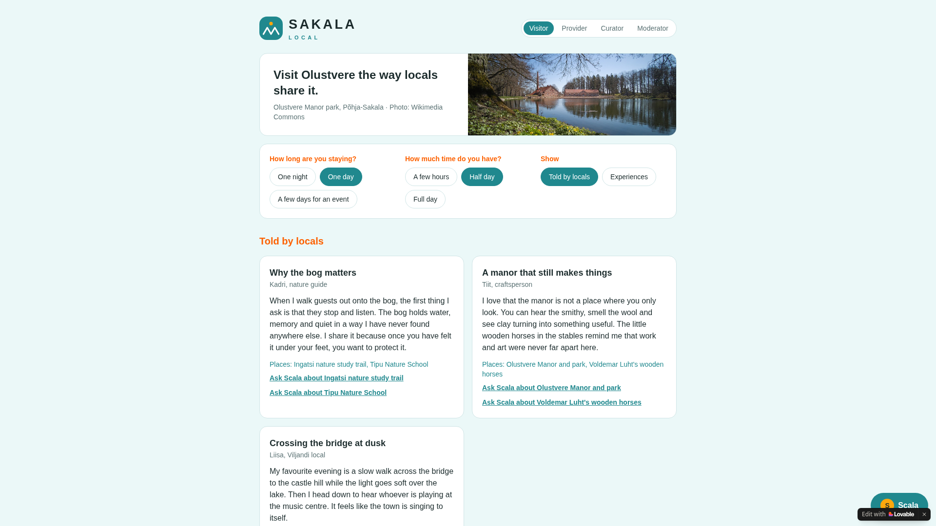
1. The default. Nothing is broken and nothing is decided. Swap the place name and it fits any region on the map.
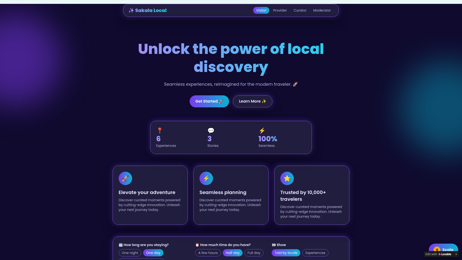
2. Full slop, on purpose. The same build, pushed with one prompt to combine every trap in one screen: a dark purple background with blurred purple and cyan blobs, a gradient headline that says "Unlock the power of local discovery", glass cards with neon borders, emoji in icon circles, and "Trusted by 10,000+ travelers" with no source behind it. This is a caricature. Lovable does not hand you this unprompted, but it shows what the default pulls toward.
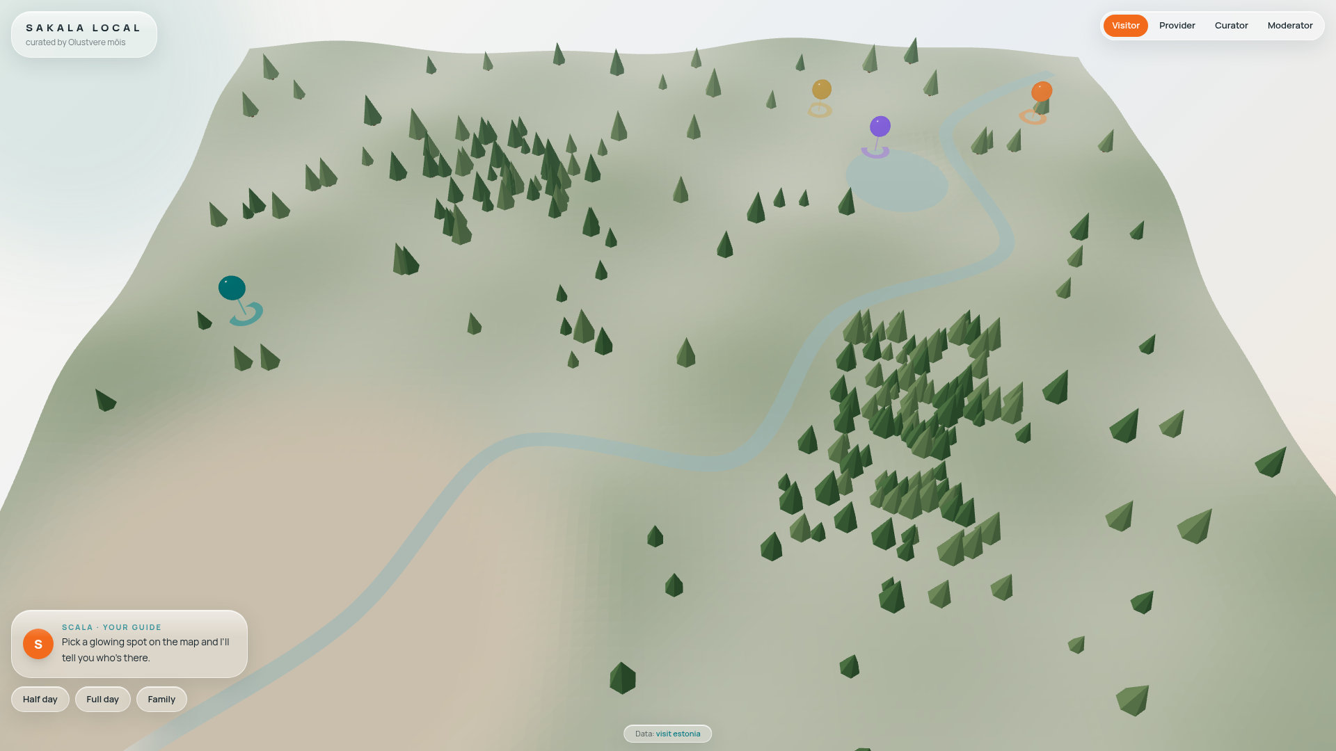
3. Built from a direction. A low-poly 3D map of the region with trees, a river and pins, in calm greens with one orange accent. A role switcher for visitor, provider, curator and moderator. Glass appears once, on the guide panel that sits over the map. The first screen shows the place, not a slogan.
The rest of this article is how to get from build 1 to build 3.
What AI slop design looks like
Eduardo Calvo of SmoothUI defines AI design slop as the generic, interchangeable UI that coding agents produce by default (SmoothUI blog, June 2026). You have seen it:
| Symptom | Why it happens | What to do in Lovable |
|---|---|---|
| Purple-to-cyan gradients, glass with neon glow | Most common patterns in training data | Name the palette and the banned effects in your first prompt |
| Rows of identical cards: icon, heading, two lines | A safe layout that fills the space | Start from the one action your user takes. Give that element more weight |
| Bouncy animation on every hover | AI adds, it rarely removes | Allow motion only where state changes |
| No focus, empty or error states, weak contrast | One-shot generation skips them | Put states and contrast in your quality bar |
| Generic headlines | Nobody wrote them for a real person | Run the founder test (below) |
Calvo names a second cause: no loop. You generate once, fix issues by hand, and they return in the next session. The process below closes that loop.
The process: discover, define, deliver
Anshu Chimala led software engineering and design teams at Apple. In Lenny's Newsletter (1 September 2026) he splits AI design work into discover, define and deliver. I run the same three stages in Lovable. Taste is the new syntax: the model writes the code, you choose the direction.
1. Discover: ask for directions before screens
Chimala says to explore several directions before you commit, and to borrow bold inspiration from outside software, such as a video game look. Lovable's docs point the same way. Ask it to put clarifying questions to you before it writes code, ideally in Plan mode.
Prompt:
Do not build yet. Give me four materially different design directions for [product], used by [user] to [one action]. For each: a name, a one-line idea, a palette, a type pairing, and one reference from outside software, such as a game, an interior style or a printed magazine. Ask me questions if anything is unclear.
Pick one. Mix two only if you can say why. Chimala also uses a random seed string to push the model off its habits, a method he credits to Sakana AI. It is optional.
2. Define: lock the identity into values
Lovable's docs say style words shift typography, spacing, shadow, radius and color, and that specific wording beats vague wording. Save your keywords in project instructions so new sections stay consistent. Kosta, a UI designer writing on HEY World, adds two checks: name colors by function, and choose fonts on purpose instead of keeping a default nobody picked.
This is the design block in the project knowledge of futurehabits.tech, lightly edited:
Premium, editorial, restrained. No indigo or purple gradients. No identical rounded cards with an icon circle on every section. No hover:scale-105 everywhere. No gradient-clipped headlines as a default. No fade-in animation on every element. Vary section layouts. One accent color per page, used sparingly for hierarchy.
Pair it with a token prompt:
Prompt:
Lock this direction into design tokens before you build any page. Colors by function: --action, --warning, --success, --surface, --text. One display font and one body font, chosen for this product. Radius [x]px. Spacing on an 8px scale. Save all of this to project instructions.
3. Deliver: critique the render, then cut
SmoothUI's loop has four steps: build with guardrails, critique against a stated bar, fix the highest-impact issue, re-evaluate. Chimala's critique uses a separate model that sees only a screenshot, with no code and no history, and scores the design out of 10. The builder keeps iterating until the score reaches 9.
You can do this by hand. Take a screenshot of the rendered page, paste it into a fresh chat, and ask:
Critic prompt:
You are a design critic. You see only this screenshot. Score it out of 10 for clear primary action, hierarchy, brand fit, restraint and contrast. Name the three biggest gaps, biggest first.
Then cut. Chimala puts it this way: "AI loves to add more, but it rarely takes away." Remove decorative effects, extra labels and custom components that add nothing. Kosta applies the same rule to motion. Keep it on primary buttons and form inputs where it signals a state change, and delete the rest.
What Lovable recommends
Lovable's docs cover the same ground from the tool side.
- Set the design early. Describe the feel in your first prompts and every new screen inherits it. Leave it for later and you fight a default look across the whole app.
- Prompt by component, not page. Build one block, review it, then move on.
- Use real content. Real headlines and prices expose layout problems that placeholder text hides.
- Mix styles by section. A bold hero and a calm pricing section can live in one site.
- Polish, then point. If the app works but looks generic, run a polish pass. For single elements, select them in the preview toolbar instead of re-prompting the page.
Four styles, four prompts
These four directions look nothing like each other. Lovable's prompt library lists 20 style directions with keywords. Pick one, name it, and add your own values on top.
"Liquid glass" is not on Lovable's list. It is Apple's name for its translucent interface style, and the closest Lovable entry is "Glassmorphic and layered". SmoothUI also counts glass with neon glow among the default slop symptoms. Use glass when you have a reason, on a few surfaces.
The hex codes and fonts below are examples. Replace them with your brand's.
| Style | Lovable direction | Best for | The slop version to avoid |
|---|---|---|---|
| Brutalist | Bold and disruptive | Agencies, startups with a point of view | Rough edges with no grid behind them |
| Liquid glass | Glassmorphic and layered | Mobile apps, consumer products | Blur and glow on every card |
| Editorial | Editorial and content-rich | Content-heavy sites, hospitality, education | Magazine fonts on a template with stock photos |
| Scandinavian minimal | Minimal and focused, Scandinavian and minimal | B2B tools, wellness, task-first apps | Beige, a default font and no hierarchy |
1. Brutalist
Lovable keywords: grid-heavy, raw typography, high contrast, oversized calls to action. Use it when you want the product to feel direct and sure of itself.
Prompt:
Design this page in a brutalist style. Strict 12-column grid with visible 2px black borders. No rounded corners, no gradients, no shadows. Oversized headline at 96px in a grotesque font. Off-white background #F4F1EA, black text, one accent #FF4D00 used only on the main button. Body text 18px with high contrast.
Watch out: brutalist is a strict system. Keep body text readable and the grid consistent.
2. Liquid glass
Lovable keywords: frosted glass, backdrop blur, layered transparency, floating elements, translucent navigation. Use it when the product lives on a phone and sits on top of rich color or imagery.
Prompt:
Use a liquid glass style. Soft full-bleed color background. Floating panels with backdrop blur, 24px radius, a 1px inner highlight border at 40% white, and a light shadow to separate layers. Translucent bottom navigation. Glass on navigation and two panels only, no neon glow. Dark text #1B1B1F on light glass. Body text must keep a 4.5:1 contrast ratio.
Watch out: on futurehabits.tech I limited glass to the header, menus, popups and the stats strip. Cards, forms and the footer stay solid. Check contrast on every text that sits on glass.
3. Editorial
Lovable keywords: magazine grid, typographic hierarchy, pull quotes, drop caps, featured imagery. Use it when the content is the product: guides, stories, places, programs.
Prompt:
Design this as an editorial site. Serif headlines in Fraunces, body in Inter Tight at 16px with 1.6 line height and a 70-character line width. Magazine-style grid with one large featured story and a column of smaller ones. Pull quotes in the accent color. Full-width photography bands. Paper background #FAF7F2, ink text #1F1B16.
Watch out: this style falls apart with placeholder text. Use real copy and real photos from day one.
4. Scandinavian minimal
Lovable keywords: whitespace, neutral tones, quiet motion, muted Nordic palette, soft neutrals. Use it when the task matters more than the look: booking, forms, dashboards, wellness.
Prompt:
Scandinavian minimal style. Background #F5F3EF, text #2B2B2B, one muted green accent #6B8F71. 96px between sections on desktop, 48px on mobile. One font family, weights 400 and 600 only. 1px borders in #E4E0D8, no shadows. Motion: fade in once, 300ms.
Watch out: minimal depends on strong type and spacing. Without them it looks empty.
Add depth after you cut
Cutting clears the space. Depth makes what is left feel built. Lovable describes its polish pass as tightening typography and spacing and improving empty and loading states, with no new features. Depth comes from a consistent system of surfaces, borders and type scale. Add one depth rule per style:
- Brutalist: hard offset shadows (4px 4px 0 black) and thick borders.
- Liquid glass: two or three layers of panels with different blur levels and one inner highlight.
- Editorial: strong type scale contrast and hairline rules between sections.
- Scandinavian minimal: small surface tint steps and 1px borders instead of shadows.
Polish prompt:
Run a polish pass. Do not add features and do not change colors. Tighten heading letter-spacing and line height. Align all spacing to an 8px scale. Make the primary action the largest and heaviest element on the screen, and let secondary elements recede. Add one level of depth: [your depth rule from the list above]. Check contrast on every text.
Design the states nobody screenshots
SmoothUI and Kosta agree here. One-shot generation skips the unhappy paths: focus, empty, loading and error states. Missing focus states and weak contrast make an interface hard to use, however good it looks.
Prompt:
Design focus, hover, disabled, loading, empty and error states for every interactive component. Empty states tell the user what to do next. Error messages say what went wrong in plain language.
Check the copy: would your founder say it?
Kosta's test for headlines: ask "would our founder actually say this out loud?" If not, rewrite until the answer is yes. Use real headlines, names and prices from your first prompt, as Lovable advises.
Before you ship: the quality bar
- The primary action is clear at a glance.
- Type, spacing and color carry meaning. None of it is decoration.
- The copy speaks to the user and asks for one next step.
- It works with real content, not placeholder text.
- Focus, disabled, error, loading and empty states exist.
- Every animation signals a state change.
- Contrast passes WCAG AA.
Match the style to your user
Kosta starts from user stories and flows, so each screen shows only what that step needs and reveals the rest on demand. Lovable asks for the same plan up front: what the product is, who it is for, why they would use it, and the one action they take. Then match the style to the situation:
- A receptionist on a desktop all day needs quiet, dense and fast. Go minimal.
- A visitor planning a trip on a phone needs imagery and mood. Go editorial, or glass with restraint.
- A brand that wants to be remembered needs a point of view. Go brutalist, on purpose.
Put the choice in your project instructions. Every new screen then inherits it.
Treat what you build as a prototype. It tests a direction with real users, and a human still decides what is ready for production.
Build it with us
Want to learn this hands-on? In our Lovable workshops founders and teams build their first working version in the room and learn to direct the design instead of accepting the defaults. You leave with a link and the skills to keep improving it, not a slide deck. See what participants built in our case studies.